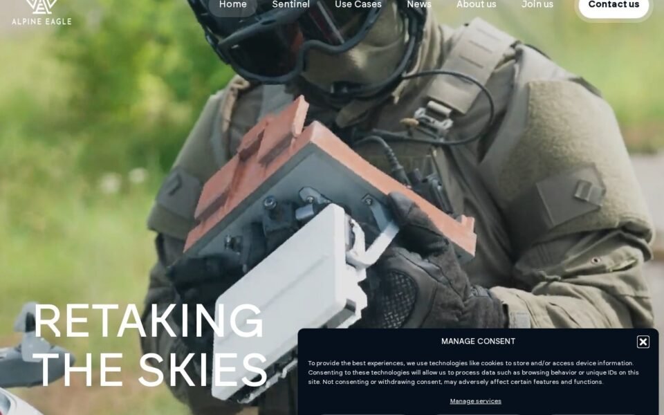
Alpine Eagle is a brand site designed in Figma and rebuilt natively in WordPress and Elementor — flex containers only, the type scale and spacing taken straight from the design file, and handed over so the client’s own marketing person could edit it without a developer. The work was a conversion, not an interpretation: the design already existed and was good, and the job was to build it as drawn.
The brief
The design existed and it was good. What the client needed was someone who would build it as drawn rather than as convenient — and who would leave behind a site their own marketing person could edit without breaking the layout.
A brand site carries a different job to a shop: nobody is arriving with a part number in mind. It has to establish that this is a serious company within a few seconds of scrolling, then make the one next step obvious. That puts almost all the weight on two things — how faithfully the design survives the build, and how fast the first screen arrives.
The problem
Fidelity
Type scale, spacing and imagery treatment all had to survive the move into a page builder — the usual place a design quietly loses its edges. A page builder makes it easy to get within ten percent of a design and very easy to stop there. Ten percent off across a type scale reads as amateur even to people who cannot say why.
Weight
Large photography is the point of a brand site and also the reason those sites are slow. The images had to stay beautiful and stop being heavy. A hero image that takes four seconds has already lost the visitor it was designed to impress.
Handover
Whatever I built, someone non-technical would be editing it a month later. A clever build that only I understand is a liability, not a feature. That constraint shapes decisions during the build, not after it — which is why I treat it as a requirement rather than a documentation task at the end.
How I built it
01 · Set the system before the pages
Global colours, global type, container presets and a spacing scale taken straight from the Figma file — so every page after the first one inherited the design rather than re-implementing it.
This is the step that decides whether a site is maintainable. Every colour in the build references a global; none are typed into individual widgets. When the brand shifts, that is one edit rather than ninety spread across pages nobody has an inventory of. The same applies to the type scale: six named styles, each used deliberately, instead of font sizes chosen by eye on a Tuesday.
02 · Build to the design, ask before improvising
Every section checked against the file at desktop, tablet and phone. Where the design didn’t specify a breakpoint I proposed one and got it signed off instead of guessing quietly.
Checking means comparing computed values — font-size, line-height, letter-spacing, the actual pixel gaps between sections — against the Figma values, not comparing screenshots by eye. Eyes are generous. The client’s designer, a week after launch, is not.
The improvising rule matters more than it sounds. Most Figma files are drawn at one or two widths. Everything between and below those widths is a decision someone has to make, and a builder who makes it silently is making design decisions without the mandate to. Proposing the behaviour and getting a yes takes ten minutes and removes an entire category of post-launch argument.
03 · Put the images on a diet
Modern formats, correct sizes per breakpoint, lazy loading below the fold and a hero that loads first. The photography looks the same; the page arrives sooner.
The specifics: WebP with the original as fallback, each image exported at the sizes the layout actually requests rather than one large file scaled down in the browser, explicit width and height attributes so nothing shifts as the page settles, and lazy loading on everything below the fold — but never on the hero, which is the one image that must not be deferred.
04 · Hand it over properly
Named containers, a short recorded walkthrough of the sections they’d actually edit, and two weeks of cover afterwards for anything that came up.
Named containers sound trivial and are not. “Homepage — hero” is something a marketing person can find; “Container #7” is something they will avoid touching, which means they will email me instead of editing their own site. The walkthrough covers five tasks, not the whole of Elementor, because a two-hour tour of everything is forgotten by the following week.
What this means for a similar project
If you have a brand design sitting in Figma, the shape of the work is the same regardless of the industry: extract the design system first, build in flex containers rather than legacy sections, decide responsive behaviour deliberately instead of by default, and treat the handover as a build constraint rather than a closing task.
The variables that actually move the estimate are how cleanly the Figma file uses auto-layout, how many genuinely distinct page templates exist behind the page count, and whether anything on the page needs to be driven by real content rather than typed in once. The full process is written up in my guide to converting Figma to Elementor, and the service itself is described on the Figma to Elementor conversion page.
Build notes
- Stack — WordPress, Elementor flex containers, custom theme
- Source — Figma, converted manually rather than exported
- Layout — containers only; no legacy sections, no absolute positioning
- Images — WebP, per-breakpoint sizing, lazy below the fold
- Handover — named templates, recorded walkthrough, two weeks’ cover
Have a design that needs building?
Send me the Figma link and a sentence about what the site needs to do. I’ll tell you what’s straightforward, what needs a decision, and what it will cost — before either of us commits to anything. Or book a 15-minute call and we will talk it through.