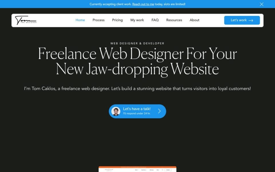
Tom the Designer is a designer’s own portfolio, rebuilt pixel-accurate from his Figma file in WordPress and Elementor — with the type scale, spacing rhythm and image treatment checked against computed values rather than by eye. Building for a designer removes the usual margin for approximation: the client can see a four-pixel error, and will.
The brief
A portfolio is a designer’s proof of competence. If the site that showcases the work is itself sloppy, the work is read as sloppy too — so the bar here was not “close enough”, it was “indistinguishable from the file”.
Tom had designed the whole thing himself. That makes the job simpler in one way and harder in another. Simpler, because there is no ambiguity about intent: every spacing value is deliberate and every type decision has a reason behind it. Harder, because there is nowhere to hide. A client who does not design will accept a heading that is a touch too heavy. A designer will not, and should not have to.
The problem
Precision as the actual requirement
On most builds, fidelity is one goal competing with budget and timeline. Here it was the deliverable. The type scale was non-negotiable — not “roughly this size”, but the exact size, weight, line-height and letter-spacing at every breakpoint.
Work that has to breathe
Portfolio layouts live or die on whitespace. The vertical rhythm between project entries carries as much of the design as the projects themselves, and it is the first thing that collapses when a page builder’s default margins get involved.
Images that stay sharp and stay light
A portfolio is mostly imagery, and a designer will notice compression artefacts that a general audience never would. The images needed to survive optimisation without visibly degrading.
How I built it
01 · Take the type scale as a specification
Before building anything I pulled every text style out of the file — H1 through H3, body, small, captions and buttons — with size, weight, line-height and letter-spacing for each, at every breakpoint that existed. Those went into Elementor’s global typography settings as named styles.
Doing this first means the build cannot drift. Every heading on the site references a global style, so there is no path by which a one-off size creeps in. It also means Tom can adjust the scale later in one place and have it propagate, which is what a designer actually wants from their own site.
02 · Rebuild the rhythm, don’t approximate it
Elementor’s defaults add spacing you did not ask for — widget margins, container padding, gaps between elements that seemed sensible to someone else. The first job in every section was zeroing those out, then applying the file’s actual values.
I used flex containers throughout, with gap rather than margin for spacing between items, because gap is the property that survives content changing length. Padding creates vertical space; fixed heights create clipping. That rule is absolute on a site where any entry might get a longer title next month.
03 · Verify by measurement, not by eye
Comparing screenshots side by side catches large errors and misses exactly the ones a designer cares about. I checked computed font-size, line-height and letter-spacing on every heading level against the Figma values, and measured the actual pixel gaps between sections top to bottom.
Hover and focus states usually are not in the mockup at all. Those I proposed and had signed off rather than inventing, because a hover state the designer did not choose is a design decision made by a builder.
04 · Optimise images without visible loss
WebP at a quality level chosen by looking at the result rather than by accepting a plugin default, each image exported at the sizes the layout requests, explicit dimensions so nothing shifts while the page settles, and lazy loading everywhere below the fold.
05 · Leave it editable
New projects get added to a portfolio regularly — that is the whole point of one. The project entries are built so adding another is filling in fields, not duplicating a container stack and hoping the spacing survives. Where a repeating pattern would otherwise mean fragile nesting, a small custom Elementor widget does the job with less markup and no way to break the layout by accident.
What this means for a similar project
Working from a designer’s own file is the best case for a Figma to Elementor conversion, because auto-layout frames translate almost one-to-one into containers and there is no guesswork about intent. The time goes into verification rather than interpretation.
If you are a designer looking for someone to build your own site, the thing worth asking a prospective builder is how they check the result. “I compared it to the design” and “I checked the computed line-height on every heading against the file” are very different answers, and they produce very different sites.
Build notes
- Stack — WordPress, Elementor flex containers, custom theme
- Source — the designer’s own Figma file, converted manually
- Type — full scale set as global styles before any section was built
- Spacing — builder defaults zeroed; gap-based, never fixed heights
- Verification — computed values checked against Figma, not screenshots
Need your own portfolio built properly?
Send me the Figma link. I’ll tell you how cleanly it will convert, what needs a decision, and what it will cost — before either of us commits. Or book a 15-minute call and we will talk it through.