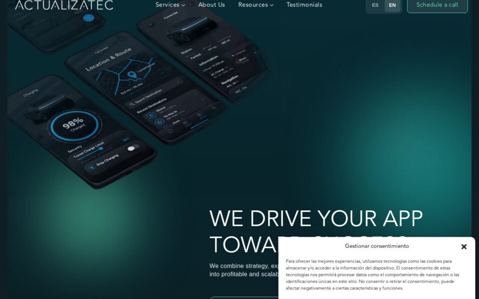
Actualiza Tec is a two-language WordPress and Elementor build for a tech services company, where the enquiry path was designed into the pages from the start rather than bolted on as a contact form at the end. Bilingual sites fail in predictable ways — untranslated fragments, layouts that break when text expands, and search engines that cannot tell which version to serve. Each of those is a build decision, not an afterthought.
The brief
A services company selling in two languages is really running two sites that must stay in step. Content parity is the obvious requirement. The less obvious one is that both versions have to convert — and the enquiry path, not the homepage hero, is where that is won or lost.
Most bilingual builds treat the second language as a translation layer applied to a finished site. That produces a site where the primary language works and the secondary one reads as an afterthought, which is exactly the impression a services business cannot afford in a market it is trying to enter.
The problem
Text that changes length
The same sentence is routinely twenty to thirty percent longer in one language than the other. Any layout with a fixed height, a tightly-fitted button or a heading balanced to sit on two lines will break in one language while looking perfect in the other.
The parts nobody translates
Body copy gets translated because it is visible. Button labels, form validation messages, breadcrumbs, the 404 page, image alt text and email notifications routinely do not — and those are the moments where a visitor notices the site was not really built for them.
Two sites, one signal to search engines
Without explicit language markup, search engines have to guess which version to show, and duplicate-content ambiguity dilutes both. Getting this right costs almost nothing during the build and is tedious to retrofit.
An enquiry path, not a contact page
A services business does not get enquiries because there is a contact page. It gets them because each page ends by making the next step obvious, in the language the visitor is reading.
How I built it
01 · Design for the longer language
Every layout was built and tested against the longer of the two translations, not the shorter. Containers size to their content, headings are allowed to wrap, and no button is fitted so tightly that a longer label breaks it.
The rule that prevents most of the damage: never set a fixed height on anything containing text. Vertical space comes from padding, so the box grows with what is in it. That is the same discipline described in containers versus sections, and bilingual work is where it earns its keep most visibly.
02 · Inventory everything translatable before translating anything
Before any content went in, I listed every string that a visitor could encounter — navigation, buttons, form labels and validation text, breadcrumbs, search and 404 pages, alt text, and the notification emails the site sends. That list became the checklist both language versions were signed off against.
This is unglamorous and it is the difference between a bilingual site and a translated one.
03 · Make the language signals explicit
Correct lang attributes on the document, reciprocal alternate-language links between every matched page pair, and a language switcher that lands on the equivalent page rather than dumping the visitor back at the homepage — which is the single most common bilingual annoyance and the fastest way to lose someone mid-consideration.
04 · Build the enquiry path into every page
Rather than one contact page doing all the work, each page closes with a next step appropriate to what the visitor has just read, in their language. Forms are short, labelled in plain words, and validated with messages that exist in both languages.
05 · Keep it editable in both languages
Global colours and type, named templates, and a structure where adding a page means adding it in both languages through the same flow — so parity is the default rather than something that decays the first time someone is in a hurry.
What this means for a similar project
If you are planning a bilingual build, the decisions that matter are made before content exists: layouts that absorb text expansion, a complete inventory of translatable strings, explicit language markup, and an enquiry path designed per page. Retrofitting any of those to a finished single-language site costs several times what building them in does.
The underlying build is a standard Figma to Elementor conversion with the language architecture layered through it rather than over it.
Build notes
- Stack — WordPress, Elementor flex containers, custom theme
- Languages — two, with full content parity as a sign-off condition
- Layout — sized for the longer translation; no fixed heights on text
- Markup — document language attributes and reciprocal alternate links
- Conversion — a next step designed into every page, in both languages
Planning a bilingual site?
Tell me the two languages and roughly how many pages. I’ll tell you which decisions need making before anything gets built, and what it will cost. Or book a 15-minute call and we will talk it through.